It is not only a matter of scale : the perspective one chooses is crucial when it comes to visualize how difficult a text is. Two main options can be taken into consideration:
- An overview in form of a summary which enables to compare a series of phenomena for the whole text.
- A visualization which takes the course of the text into account, as well as the possible evolution of parameters.
I already dealt with the first type of visualization on this blog when I evoked Amazon’s text stats. To sum up, their simplicity is also their main problem, they are easy to read and provide users with a first glimpse of a book, but the kind of information they deliver is not always reliable.
Sooner or later, one has to deal with multidimensional representations as the number of monitored phenomena keeps increasing. That is where a real reflexion on finding a visualization that is faithful and clear at the same time. I would like to introduce two examples of recent research that I find to be relevant to this issue.
An approach inspired by computer science
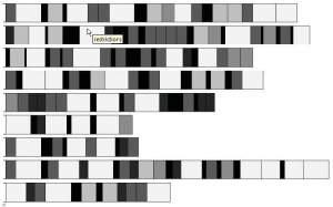
The first one is taken from an article by Oelke et al. (2010). It is part a work by computer scientists of Konstanz (Germany) who try to apply their approach and their experience of visualization to language processing.

A visualization of several German political programs in terms of text complexity (Oelke et al. 2010)
It is quite obvious that the summary is obfuscated by the amount of information. As far as I know, this kind of approach grounds on the belief that the human eye is able to extract patterns out of a complex image. This idea seems to date back to Bertin (1967), a seminal contribution to information visualization. But in this case the appearance of patterns does not always take place, as one may not easy control the display of information.
Nonetheless, there are two interesting facts in this work, asthe authors start from readability formulas comparable to those used by Amazon. The difference is that they try to mirror the possible evolutions within the text as well as the possible correlation of phenomena.
A visualization following the course of the text
The second example comes from Karmakar & Zhu (2011). It features an attempt to take advantage of text structures to reach an relevant image of a text. In this regard, their approach is closer to natural language processing, its operating model and its evaluation metrics.
It is a local approach of readability as the text is seen in a linear fashion:
Linear visualization of the sentences from a newspaper article in English (Karmakar & Zhu 2011)
The horizontal bars on this chart picture the sentences of the article, so that a relevant criterion immediately strikes the eye: the evolution of sentence length in the text becomes clear. So is the distribution of complex words and complex parts (as they use tools to estimate parse tree depth) in the text.
I will not discuss here the criteria which Karmakar & Zhu use to assess readability, I would just like to point out that their definition of complexity is not necessarily in accordance with linguistic standards and that their interpretation of the visualizations is not obvious (especially their views on clause complexity).
Conclusion
There are a few common features between these research papers which seem to be good starting points :
- In both cases, difficulty is shown by color intensity, where darker (or more intense) signifies a more complex passage.
- A visualization of this kind may include several scientific frameworks and in fact heterogeneous indicators. In order to draw relevant conclusions one has to be aware of these differences, which could also be shown (for instance by letting the user select the framework or the indicators that appeal to him).
- The ability of the human eye to distinguish between various phenomena and to apprehend color differences (Bertin 1967) should not be under- nor overestimated. There may be an optimal degree of visual complexity.
References
- S. Karmakar and Y. Zhu, “Visualizing Text Readability,” in 6th International Conference on Advanced Information Management and Service (IMS), 2011, pp. 291-296.
- D. Oelke, D. Spretke, A. Stoffel, and D. A. Keim, “Visual readability analysis: How to make your writings easier to read,” in VAST 10: IEEE Conference on Visual Analytics Science and Technology, 2010, pp. 123-130.
- J. Bertin, Sémiologie graphique : les diagrammes, les réseaux, les cartes, Paris: Bordas, 1967.